01
The problem
This project started with my own experience as a new mum. I took photos of my son's milestones but never noted the dates, and today I can't remember when he first walked or said his first word.
On very little sleep, I was also keeping track of feeds, which side I'd fed on, wet and dirty nappies, and my own meals and water, using a timer and my memory. Online, the advice never stopped, and much of it wasn't backed by evidence. BabyCenter helped during my pregnancy, but it stopped fitting once my son arrived.
How might we give parents one trusted place to track their pregnancy, their baby and themselves, and keep it useful as their needs change?

02
Research
My objective was to narrow down the features and functions parents need most. I combined two methods, starting with conversations to explore the problem, then a survey to measure it.
Context for UK readers
I ran this research in India. There, many families use private hospitals and keep their own records on paper: a vaccination booklet and a growing folder of hospital reports. There was no widely used, central app like the NHS App for managing appointments and records.
Method 1
Interviews
Informal interviews with 4 mothers, friends and family who are new parents.
Method 2
User survey
A survey of 14 new and expecting parents on information sources, health tracking, appointments and milestones.
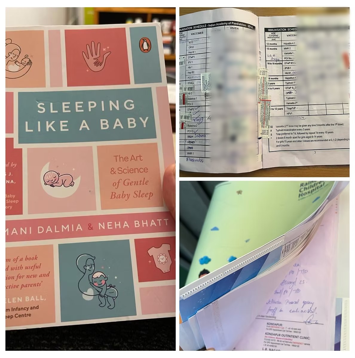
What parents told me in interviews
Milestone tracking
A strong need for a user-friendly, integrated way to track milestones.
Health logging
A simple way to log health information like vaccinations and doctor visits.
Personalised tips
Advice tailored to the child's age and developmental stage was highly valued.
03
What the survey showed
The survey of parents in India confirmed what I heard in interviews, and put numbers to it.
Information overload
- Parents gather advice from websites, healthcare providers, social media, books and apps.
- They track milestones, nutrition, appointments, sleep and medication.
- Many struggle to track these consistently, pointing to the need for one easy system.
Appointment management
- 35.7% use paper planners and 14.3% rely on their healthcare provider's system.
- None of the respondents use a digital calendar.
- Missed or double-booked appointments happen from time to time.
Milestone documentation
- Recording milestones matters to most parents.
- Methods vary, but staying consistent and finding an easy method are the common struggles.
Cognitive load and the all-in-one wish
- Switching between multiple tools feels like a burden.
- Must-haves: integrated health tracking, appointment management, milestone documentation, and personalised tips and resources.
04
Personas and structure
From the interviews and survey I built three personas: the Expecting Mother, the Newborn Parent, and the Eco-Conscious Parent. I refined them as more responses came in, then mapped the app's main sections and features in an information architecture.

“Painting our baby's dreams with love and patience.”
Newborn Parents
David & Michelle
Bio
David and Michelle, a loving couple in an urban setting, navigate the joys and challenges of parenting their baby girl. They want an intuitive app for tracking development and managing time, reflecting their partnership and shared commitment to family life.
Goals
- Understand and adapt to their baby's sleep patterns
- Make sure their baby is meeting developmental milestones
- Manage their time between parenting, work and personal life
Challenges
- Lack of sleep while trying to establish a routine
- Navigating parenting roles and responsibilities as a couple
- Finding quick, reliable answers to sudden parenting questions

“Designing life, one heartbeat at a time.”
Expecting Mother
Sophia
Bio
Sophia, a 30-year-old graphic designer, is starting her journey into motherhood, balancing creativity with a healthy pregnancy. She wants an app that offers trustworthy advice and a community to share this new chapter as she prepares for her first child.
Goals
- Stay healthy during her pregnancy
- Be well prepared for childbirth
- Find a supportive community of other expecting mothers
Challenges
- Balancing work with pregnancy
- Overwhelmed by the amount of information available
- Finding trustworthy advice tailored to her own health needs

“Eco-parenting for a brighter future.”
Eco-Conscious Parent
Alexis
Bio
Alexis, an environmental scientist and single parent in a coastal city, is dedicated to raising their toddler with eco-conscious values. They want an app that guides sustainable parenting and connects them with like-minded parents.
Goals
- Raise their child with an awareness and love of the environment
- Find eco-friendly parenting products and practices
- Connect with like-minded parents for ideas and support
Challenges
- Finding reliable resources on eco-friendly parenting
- Balancing eco-conscious choices with convenience as a single parent
- Teaching their child about sustainability in an engaging way
Trackers & Logs
AI Insights & Recommendations
Appointments & Reminders
Health Records
Additional Features
Community & Support
Search & Help
Settings & Personalisation
05
Key decisions
The research pointed to two calls that shaped everything else.
One hub instead of separate tools
Why
78.6% of parents wanted everything in one place, and switching between tools was a big part of what made them feel overwhelmed.
The trade-off
An all-in-one app can feel crowded. I kept the first version to four core features and saved lactation support and a thrifting marketplace for later.
Quick tasks over endless scrolling
Why
Tired, busy parents need to log something and get back to their day. The goal was support, not another app competing for their attention.
The trade-off
Less room for browsing content, so articles and tips live in a searchable information hub rather than a feed.

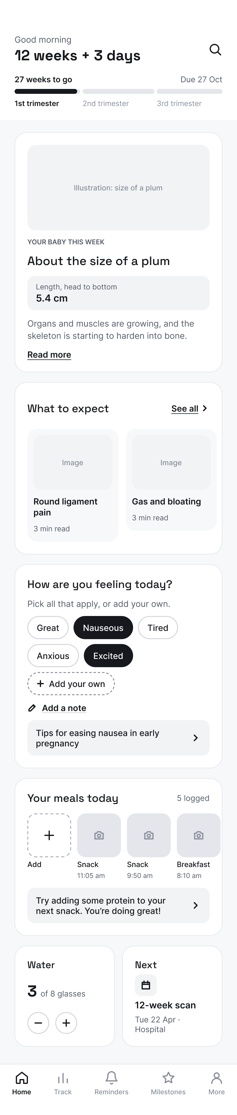
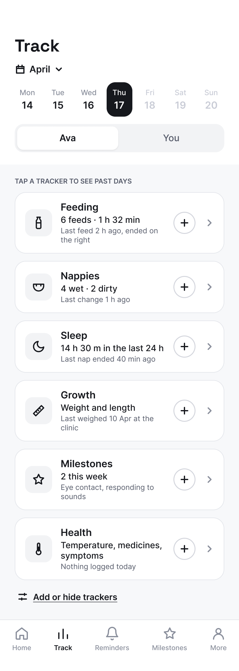
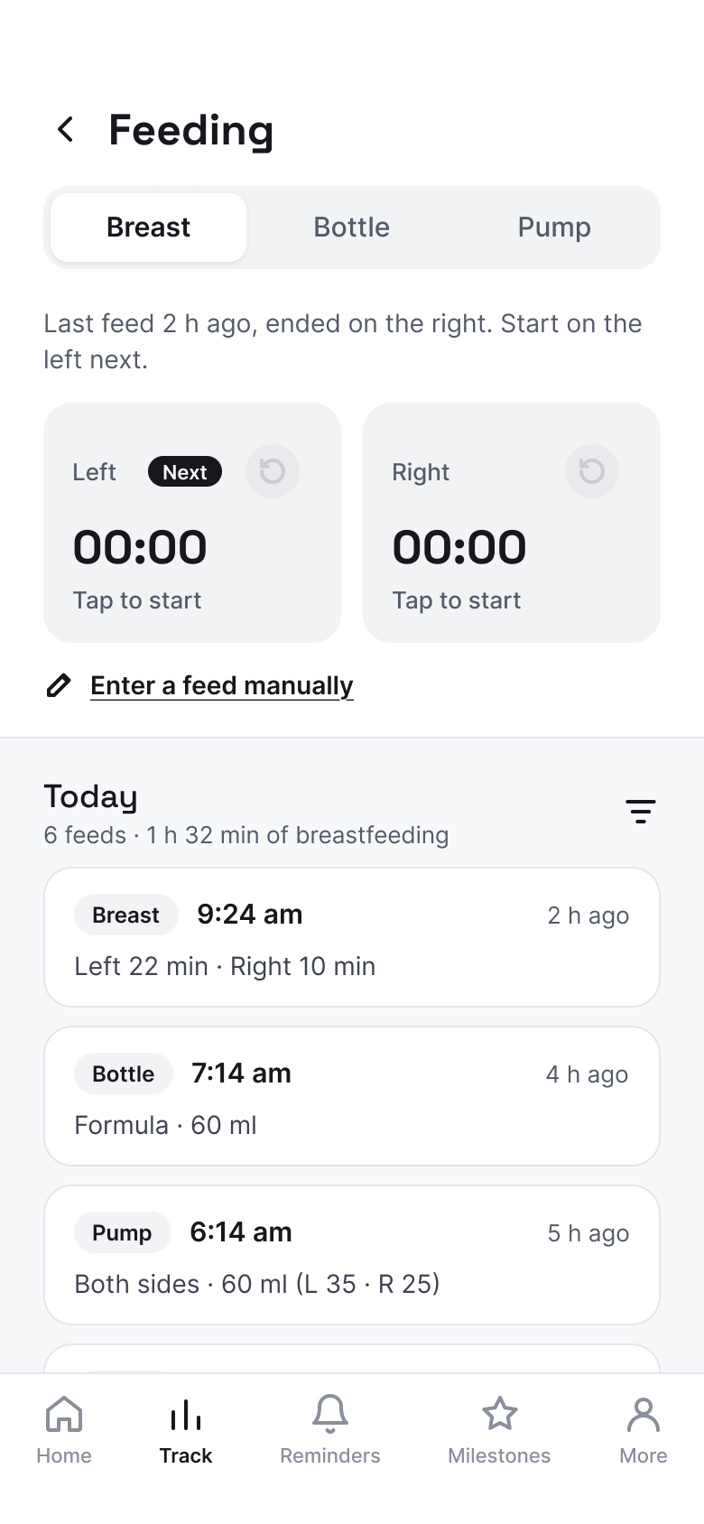
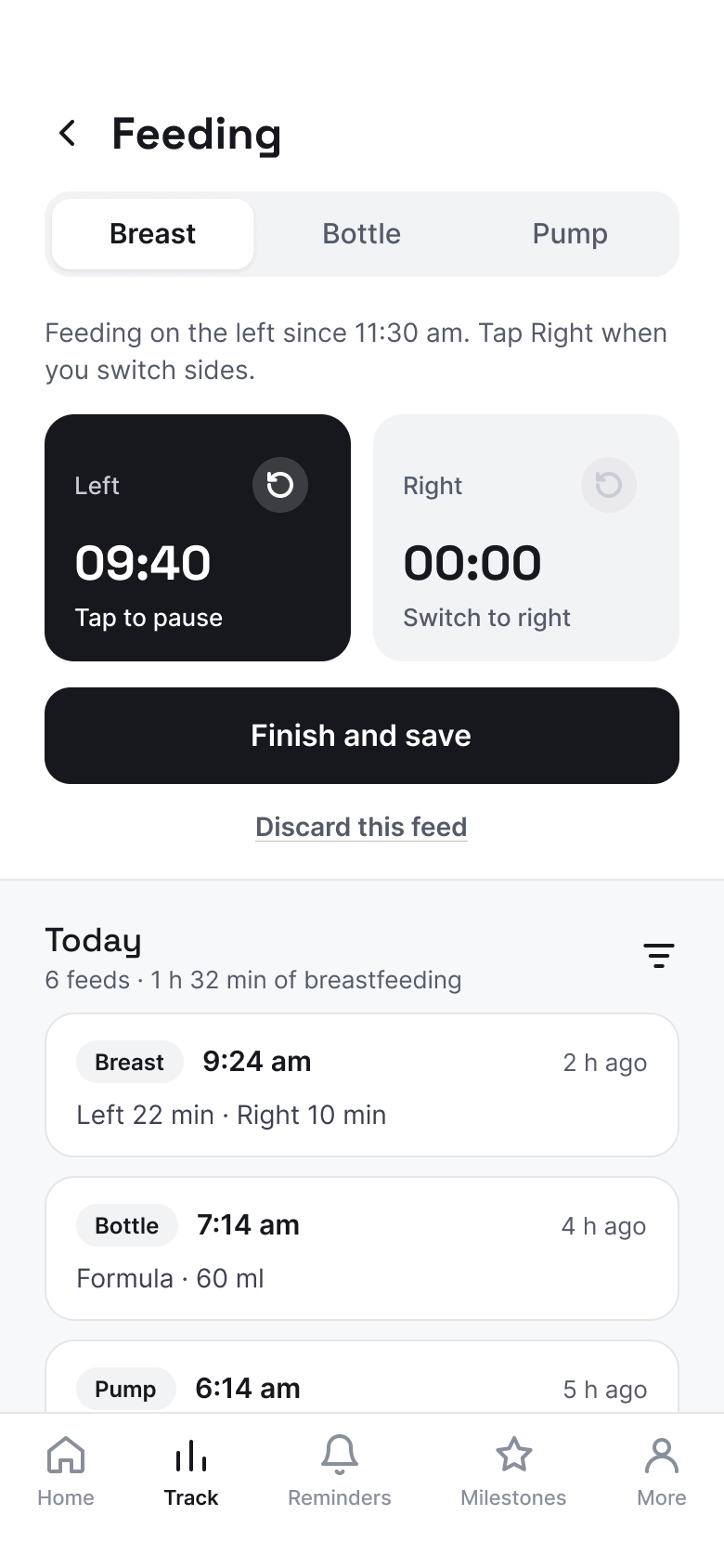
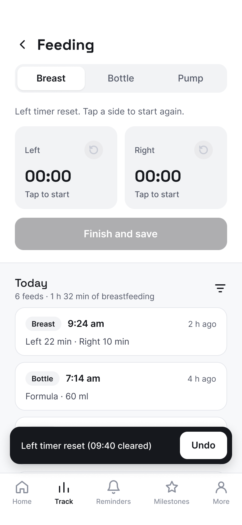
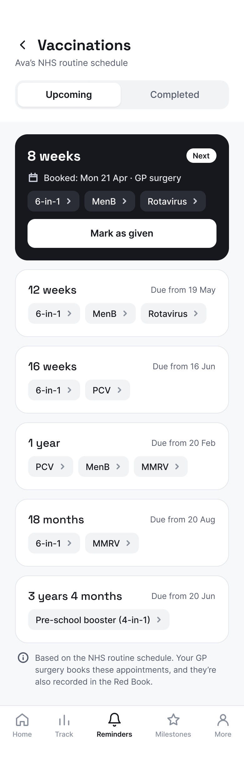
Key screens from the redesign, mapping the journey for each core feature.
Try the prototype ↗06
The solution
Bump to Baby is one simple place to track health, manage appointments and record milestones, built to reduce mental load and respect parents' time.
Design philosophy
Support, not distraction.
Quick, intuitive interactions and minimal scrolling. Every screen is designed to help a tired parent finish a task and get back to their family, valuing efficiency and ease over time spent in the app.
It brings together four core features:
Information hub
Articles, tips and guides from evidence-backed sources only, like the NHS, not random posts, with search and clear categories.
Health tracking
Log feeds, sleep, nappies and medication in a tap. The feeding log shows which side you fed on last, so there's nothing to remember at 3am. For mums, there's a simple meal log (calories and protein) and a water tracker.
Appointments & reminders
Add appointments or sync your phone calendar, get reminders, and jot down questions for your midwife or health visitor.
Milestones
Record milestones with the date, notes, photos and videos as they happen, so every photo keeps its story.
07
Rethinking it for the UK
After moving to London, I looked at how the idea holds up within the NHS. The UK is far more digital than the system I first researched, so some features needed a rethink. The core problem, though, turned out to be just as real.
What's different
- Hospital and GP appointments can be viewed and managed in the NHS App.
- Many trusts use digital maternity notes, such as Badger Notes.
- The Red Book now has a digital version, the eRedbook, alongside the paper copy.
- An independent app can't book NHS appointments or read NHS records without strict data and approval checks.
What stays the same
- Information is still scattered: the NHS App, maternity notes, the Red Book, letters, and separate apps for feeds and sleep.
- Parents still feel overwhelmed and tired, and still have to switch between tools.
- None of these NHS tools covers daily logging, milestone memories or partner sharing in one place.
How the design adapts
- Connect, don't replace: official records stay in NHS tools, and the app links out to them.
- Appointments become reminders and preparation, not booking.
- The focus shifts to what the NHS doesn't do: daily logs, milestones, tips and a shared family timeline.
- Privacy first: parents choose what to add, and health data stays under their control.
08
Next steps
Next, I'll test my wireframes with expecting and new parents in London. That one round of testing checks how easy the flows are to use, and whether the UK adaptations fit the NHS tools parents already rely on. Then I'll refine the designs based on what I learn.
Later versions could add lactation support, with access to lactation consultants, tutorials and tips matched to the baby's age, and a thrifting marketplace for second-hand baby items, which came out of the Eco-Conscious Parent persona.
09
Reflection
Not every parent I spoke to used an app. A few had got through pregnancy and their baby's early years without one at all.
I started out thinking the milestone problem was just mine. On social media, every other parent seemed to have recorded their child's firsts, and I felt I was the only one who hadn't. The interviews and survey showed me that other parents felt a strong need for milestone tracking too.
If I did it again, I'd talk to more parents. I interviewed 4 mothers and surveyed 14 parents, and I'd like to hear about the difficulties of a bigger group.
Coming back after my career break, this project gave me the confidence that I can still do this. Design is like riding a bike: once you've learned, you never forget. I haven't lost touch, and I still feel the same passion and spark in how I see things.